Tuesday 30 May 2017

LOVE A BOOK? SHARE A BOOK • Michelle Robinson

It’s a wonderful time to be a reader.  Apart from if you're reading this post - I can't get the font size to behave, apologies. Anyway...

There's talk of this being a 'new golden age' of children's literature. Looking at the shelves, I think that might be right. 


New and established talents are creating some real gems. Sadly many adults buying books for children still like to shop 'safely' and pick up books by the same old household names - the school I volunteer at has a thing for Just William. But pick up something brand new and you're in equally safe hands.

Today's authors and illustrators were raised on the classics. We've done our homework, learned from the masters plus been influenced by new sources and a changing world. We work with publishers who know what makes books great and who can't afford to  create rubbish. 

Roald Dahl will always be there, ditto Enid Blyton and Beatrix Potter. Classics are amazeballs, I agree! 
Nostalgia's nice! But how about discovering something fresh? 


Have you seen what Philip Reeve and Sarah McIntyre are producing?! Alex T Smith? Will Mabbitt? Jonny Duddle? Swapna Haddow and Sheena Dempsey? Kes Gray and Jim Field? Laura James and Eglantine Ceulemans? I could go on FOREVER - but it's much more fun to pop to a book shop and browse.


There’s a book to turn every reluctant reader on to reading. There’s a book to help any reader suffering from Beast Quest/Rainbow Magic fatigue. The industry is even beginning to wake up to the fact that there need to be books in which every child can recognise themselves. ...Pity about the lack of libraries to connect children to any of these books, AND the lack of column inches  dedicated to children's reading... but that’s another blog post entirely.

As this is my last post for the Picture Book Den I'd like to use it to ask a favour. If you love children's books, please SHOUT ABOUT THEM. 


LOVE A BOOK, SHARE A BOOK

Try something new! Spread the word about great books!
Use and support libraries! 
Give books as gifts!
Support independent book shops!
Tell people about books you’ve enjoyed!
Donate a book to your local school library!


Whose books have you fallen in love with lately? Please share a recommendation in the comments thread below - new or old. I’ll kick things off: I was struggling to find non-fiction history books that my son liked. He loves Horrible Histories on TV but really doesn't enjoy the books (which still seem to dominate the market...).

All hail MARCIA WILLIAMSMarcia writes excellent non-fiction told in comic strip style. We're now binge reading her books and I'll be investing in a set for the school library at Christmas. Hooray for varied book shelves where you can still make new discoveries.

Please share a book below - no self promotion, please. Thanks so much - see you in the children's section!
____________________________

Michelle Robinson is a best-selling picture book author. Her latest, ‘THE HAT THAT ZACK LOVES’, is illustrated by Robert Reader and publishes with Puffin in July 2017. 


x

Monday 22 May 2017

Time Goes By • Abie Longstaff

I love picture books that give a sense of time moving - especially those where the seasons change in the background.

In 'Dear Daddy' by Philippe Dupasquier, Sophie writes to her father who is away at sea.


It's a very sophisticated picture book. Using a clever split-scene layout, it shows us both Daddy's and Sophie's world, and deals with complicated conceptual ideas of time. Children can see that the seasons change for Sophie but not for her father, who is in a different time-zone. All this is accomplished in remarkably few words due to Dupasquier's busy, detailed illustration style.

This was one of my favourite pages. It shows the split screen of the season where Sophie is, and above where her dad is. My sisters and I loved it because we grew up in Hong Kong, which is depicted in the upper section.

Across the Fairytale Hairdresser series, Lauren Beard and I do have the seasons change, but I've never managed it in one single book - and I'd love to try!

It's summer in The Fairytale Hairdresser and Aladdin

And winter in The Fairytale Hairdresser and Father Christmas
For me, the most beautiful book showing seasonal change is 'I am a Bunny' by Ole Risom and Richard Scarry.


My mother read this book to me, and I read it to my own children. It is a perfect example of a simple, yet exquisite, picture book - one where poetry meets art. I find it almost meditative in quality and very moving. Nicholas, the bunny, has a real appreciation for his world, and the illustrations reflect this:


I suppose I'm thinking about seasons, and change, because I'm moving on from the Picture Book Den. I've loved being a part of the Den for years now and I'm sorry to go; but it feels right to have a change. I'm sure I'll be popping up somewhere else soon but for now: thanks to my fellow Denners, and to readers of the blog.

See you around! :)

Monday 15 May 2017

Step-by-step Picture Book Writing in Layers • Natascha Biebow


Betty Crocker's Rainbow Surprise Inside Cake - writing in layers!
In my writing and teaching, I have recently begun to play around and reflect on the process of creating a picture book in a different way. 

Picture this:


Have you ever tried drawing something and been frustrated that it doesn’t turn out quite like you intended? 

Uh-huh, I hear you nod.


Have you ever watched someone drawing something and admired their apparent ease? Like this!

Yes, I hear you nod.


But is it easy?


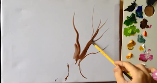
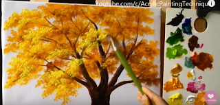
If you look closely at this process, you will notice that it’s a question of layering – starting with the outline, very sketchy, with a light touch of the paintbrush or pencil. Then, the artist adds more shape, a bit more texture, rubbing this bit out, adding that bit there, playing with the idea. Slowly, the general shape begins to emerge! 

from ART90OP's from youtube.com/acrylicpaintingtechniques

It’s usually not a question of starting out with a fully-formed piece of work and trying to edit that because, frustratingly, well, you can’t START with cake. 
 
You have to put in all the ingredients – and you have to first decide WHICH ONES? – and then lovingly bake your picture book story so it rises and is light and fluffy and just right for young readers. 


If you try to start with cake and keep fussing, adding new and interesting toppings, it may LOOK marvelous . . .


. . .  BUT if the cake isn’t right in the first place

 it will never work. 


Coming back to our artist’s process:


First, the artist sketches out the idea with a light touch, testing it out in the space, finding its shape.
from ART90OP's from youtube.com/acrylicpaintingtechniques

You can try pacing out your picture book into 12-14 spreads. 
Look for a way into your story, find a strong hook. 

Next, the artist adds stronger, darker lines and details to define the initial sketches. 


from ART90OP's from youtube.com/acrylicpaintingtechniques
Make sure you have an opening that hooks in the reader and an ending that bookends the opening and gives the story a satisfying conclusion, a twist or that 'aw' factor. Check your plot doesn’t read like a list, with everything having the same weight, that there is a clear climactic turning point. 

Now, the artist adds colour and texture, in layers – look how it’s added depth! 

from ART90OP's from youtube.com/acrylicpaintingtechniques

Check your characters’ motivations. Make sure readers will care about your protagonist. Add voice. Make it the story only you could have written or illustrated.


Then, the artist stands back and observes. He adds the final touches.  


from ART90OP's from youtube.com/acrylicpaintingtechniques

At last, ta-da! The result is a picture that sings, that speaks to its audience.

from ART90OP's from youtube.com/acrylicpaintingtechniques


Watch the artist at work! 

Creating picture books is a frustrating business. Not only do you have to have that singular commercial idea, but it has to be written with voice, style, pace and emotional depth to leave the reader with a feeling of satisfaction, a laugh, a tear, an ‘aw’ moment.  


Many of my students are frustrated at the fact that it doesn’t all come together at once, that you can’t edit something that isn’t yet on the page. And this is just it – you must first sketch it out and play with the idea, like the artist. THEN you can add layers, erase, add and shape and depth.


Annoyingly, when you stand back – and you must read your work aloud and try to be objective, like a reader – you notice things that must be edited further and changed. And when you make these changes, often new things unravel. Argh!


Once you have a working draft, it is time to add in the texture, the final toppings, the ta-da! to give the story pizzazz and make it really shine.


Here, a good technique is to go through and look carefully at each word. Use the highlighter revision technique. Read it aloud again.

But working in this way is rewarding and gives the creator permission to experiment, to start with a sketch and PLAY around a bit before investing time and effort in fine-tuning their work. See all those multi-coloured Smarties in the Rainbow Surprise Inside Cake (below)? Go on, have a play, taste a few even, and figure out the heart of your story cake – the nugget of your story before rolling up your sleeves to add the rest of the layers.


________________________

Natascha Biebow
Author, Editor and Mentor

Blue Elephant Storyshaping is an editing, coaching and mentoring service aimed at empowering writers and illustrators to fine-tune their work pre-submission.  Check out my small-group coaching Cook Up a Picture Book coursesNatascha is also the author of The Crayon Man (coming in 2019!), Elephants Never Forget and Is This My Nose?, editor of numerous award-winning children’s books, and Regional Advisor (Chair) of SCBWI British Isles. 

Monday 8 May 2017

Looking at illustration: traditional printmaking in children's picture books • Paeony Lewis

Last autumn I enrolled on a print-making course. I began with the brilliant idea of producing my own illustrations for one of my picture-book texts. Unfortunately as the course has progressed my brilliant idea no longer feels quite so brilliant! I've begun to wonder if it's still logical to use traditional printmaking techniques in the digital 21st century. 

Traditional printmaking allows multiple prints of the same image, but this isn't necessary as picture books use digital printing. Even so, different printmaking processes also have identifiable visual characteristics. Plus there's the bonus of looking handmade which is a quality that's become appreciated since we've become saturated with uniform digital images. Therefore maybe there is a niche for picture books that use traditional printmaking? Or perhaps traditional printmaking has been adapted by illustrators? 

In this blog post I share my musings and picture book research. I've concentrated on just two types of *relief printmaking (*where ink is applied to uncut, raised areas). I've tried to make techniques clear for those who know nothing about printing; and for those of you who are experts please feel free to correct me!

Traditional wood engraving and woodcut
Wood engraving is a long-established traditional method of relief printing. The wood is carved and the ink is rolled over the raised areas of wood and a print is then taken.


These images are from a 1987 prospectus produced by Macmillan Publishers which offered limited edition prints from the original 19th-century engraved boxwood woodblocks. The original engraved block is on the left and the reversed, printed 'electro' version from Alice's Adventures in Wonderland is on the right. 

In the 19th century the Dalziel brothers were chosen to engrave Sir John Tenniel’s drawings for Lewis Carroll’s Alice’s Adventures in Wonderland and Through the Looking-Glass. Boxwood was used as it’s hard and can withstand several thousand impressions, but after that the block is too worn. However, Victorian illustrated books flourished with the help of a new commercial process called ‘electrotype’ which enabled metal copies to be made of the original woodblock, allowing for far greater print runs, albeit a little of the original detail would have been lost. If you're interested here's a good  blog post on the Alice illustrations.

Looking at the wood block above you can see how the engraver carved lines to create shape, texture, light and shade. Hatched lines are closer together where darker shading is needed. Deeper, wider lines give more emphasis. 


We're now In the 21st century and have digital printing so in theory wood engraving/electrotype isn’t vital for illustrations in large runs of printed books. Even so, this distinctive form of illustration has unique individual characteristics and a few illustrators still use this time-consuming method, including the award-winning John Lawrence (more on him later). 


 American illustrator, Mary Azarian,  uses a method called woodcut. It's similar to engraving but woodcuts use the side grain and incorporate the natural grain and pattern of the wood, whilst wood engraving is finer and uses the end-grain which has a closer texture. 

Mary Azarian handcolours her wood-cut prints, rather than producing multiple woodblocks for each separate colour. The colour is therefore rich, with more variation and tones. In many of the illustrations it's almost as though the lines of the carved wood act as an outline.


Snowflake Bentley (1999 Caldecott Award) is one of many books illustrated by Mary Azarian.
Houghton Mifflin (reprinted 2014)


I have a small pile of cheap soft wood waiting to be cut, but I'm not very good at
sharpening my tools and wood blunts tools very quickly,
so for the moment I've concentrated on linocut.

Linocut

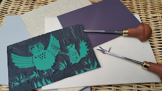
Not as easy as a potato-cut print, but softer to carve than wood and cheaper. Linocut is literally the carving of a sheet of ordinary hessian-backed lino. Manufacturers have also created new vinyl surfaces such as Softcut, Easy Carve and Japanese Vinyl (see image below). Linocut does not have the esteemed heritage of wood engraving, but is a 20th-century development that uses the same tools and techniques. The principles of cutting are similar, although the lines aren't quite as fine as wood engraving as lino is less robust.


Different lino/vinyl surfaces


One of my simple linocuts (Japanese vinyl) being inked. It won't only be shades of pink!


A large printing press applies even pressure to the linocut.
It can also be done by hand, though applying enough pressure can be tricky.


The Haunted House by Kazuno Kohara,
Macmillan 2008
One contemporary illustrator who has used linocut in her four picture books is  Kazuno Kohara. Her first book is still my favourite, The Haunted House, as it combines deceptively simple illustrations with a delightful, fun story.

With bold simplicity, Kohara’s linocut illustrations use black ink on orange paper. The white ghosts may well be white tissue paper (a process called chine-collé) - I'm guessing! 


White tissue paper?
Guessing how an illustration is produced can be fun.


Some of the lino cutaway tool marks can be seen on the pages as flecks of black ink and this adds to the handmade feel of the artwork. In later books Kohara has removed these marks for a cleaner image and I suspect this may be because if you don't know the reason for the black marks you might think they were a printing error, rather than an interesting part of the print that many linocutters deliberately leave.

 
Tool marks in the cutaway areas of lino.


I also like the occasional use of thin ink, so the orange paper peeps through, as this gives texture to the page.
 

Inside Kazuno Korhara's The Haunted House, Macmillan 2008

 
Another linocut picture book: Here Comes Jack Frost
by Kazuno Korhara, Macmillan, 2009. I adore the simple illustrations.
The lines are clean apart from the stars that appear to have been loosely dug out
of the lino, which gives an effective smudged appearance.

So Kazuno Kohara has taken a traditional method of relief printing and produced stylistic illustrations that are contemporary whilst having identifiable linocut characteristics. 

This Little Chick by John Lawrence,
Walker Books, Candlewick Press 2013
 Earlier I mentioned  John Lawrence. He's an acclaimed illustrator and wood engraver who also uses linocut in his children's picture books. His engraved illustrations are more traditional in appearance and make excellent use of the properties of relief printing. There's a wide variety of patterns, lines and shapes, and colour too.
John Lawrence has contributed to over 200 books, including Lyra's Oxford (Philip Pullman). For many of his later picture books, including  This Little Chick, he has preferred to use vinyl (linocut). There's a  Guardian article here which includes an interview that mentions a vinyl sheet might cost 50p, whilst a much smaller piece of boxwood costs over £100. Plus vinyl is very much easier to carve, especially if you're going for bold lines rather than intricate engraving.
 
Inside This Little Chick, John Lawrence


Close up of part of the sheep's characterful linocut marks,
giving attractive texture and vitality.
Each white line is a tool mark, digging into the vinyl/lino.


After having assumed Lawrence's illustrations were all traditionally produced, I've just read that some of his picture books, including The Little Chick, Tiny's Big Adventure and Seahorse use Lawrence's traditional vinyl/linocut prints and then digitally play with them to form collages and add texture and colour. This makes sense as I did wonder at the colourful complexity of some pages - in relief printing you need to apply each coloured ink as a separate block. Therefore here's an illustrator and printmaker who has retained the original qualities of wood engraving and linocut, whilst using a computer to scan the prints and then play with them on the page. This allows new designs, complexity and flexibility. The flexibility is very important as editors frequently need changes.


Seahorse: The Shyest Fish in the Sea,
by Chris Butterworth, illustrated by John Lawrence
Walker Books 2007


The Little Black Fish by Samad Behrangi,
illustrated by Farshid Mesghali

First published 1968,
this edition 2016 Tiny Owl Publishing
 

One illustrator who didn't have access to computers in the 1960s was Farshid Mesghali. This Iranian-born artist inspired me with his illustrations for the award-winning The Little Black Fish. First published in the late sixties, Mesghali used linocut prints, often printed over what I assume is a background monoprint. (A monoprint as a one-off image where paper is laid over worked ink or impressions are made on the back of the paper that lays over ink - it's a very spontaneous form of printing, favoured by artists.) Personally I adore the swathes of textured ink of the monoprint that contrasts with the bold patterns of the linocut prints. This was exactly what I'd been thinking about for my own picture book illustrations.


Seagull illustration from The Little Black Fish

I really feel Mesghali has used the intrinsic properties of linocut prints in this seagull illustration. There's a handmade vibe from the tool marks that also add texture and movement. The overprinting of the waves and seagull's feet give an impression of turbulence. The limited colours from separate linoblocks allow the red beak to shout 'danger'and draw our attention to the fish eye. As I'm not always a fan of excessively detailed prints, I like the way a visual impact is made with just a few detailed feathers. 

Another illustration from The Little Black Fish. This time the linocut fish are inside the seagull's stomach.
The effectiveness of the background monoprint can be seen.


I wonder if Mesghali would have used digital options too if they'd been available in the 1960s?  With my own prints I've been concentrating on using only traditional techniques, mainly because digital manipulation is discouraged on the course I'm doing. However, there are more design options available with the use of computers and most picture book readers are only concerned that the illustration looks good. Also, if one mistake is made or an editor asks for a change, then a new linoblock or woodblock would need to be carved. For example, my embarrassingly amateur diving owl looks too angry and there are errors. Therefore, although I've carved a second block for an additional colour, it'll all need to be dumped, which is quite time consuming.


It doesn't have to be wood or lino


Animal Babies in the Forest by Julia Groves,
Child's Play, 2016
One of a series of four board books

Relief printing doesn't have to only include wood or lino. Foam, card and polystyrene pizza bases are all options. Sometimes they're just the catalyst for an illustration.

The illustrator, Julia Groves, is always in search of new ways to incorporate relief printing into her books. She discovered a love of printmaking at Cambridge School of Art and went on to study Fine Art Printmaking at Brighton University before completing an MA in Children's Book Illustration at Anglia Ruskin. To me, her illustrations manage to combine a stylish simplicity with warmth and she's an illustrator who makes good use of digital design whilst retaining a homemade feel. Here's what she says:

"My children’s book illustrations have evolved out of my love of printmaking, an obsession with a less-is-more aesthetic and a bold, but sometimes restricted colour palette. Although I work primarily in Photoshop, I always begin with a traditional print, drawing or even just a printed texture. It is important to me that my final work, although digital, retains a hand-made aesthetic. I also love to create typography from traditional wooden letterpress as well as cut-paper."

Julia Groves: Ink is applied to a relief block and printed in black.
The print is then scanned and coloured digitally in separate layers in Photoshop.

"I've discovered that traditional methods of printmaking can be both time-consuming and frustrating, but there is a wonderful sense of achievement in the hand-made. The combination of traditional and digital works well for me and allows me the freedom to change a colour at the press of a button, whilst retaining a sense of the origins of printmaking. The main advantages of creating illustrations digitally for children’s books are that they are easy to amend and ready for publishing, unlike original artworks which need to be delivered and scanned before printing."


From the Animal Babies series by Julia Groves, Child's Play, 2016

___________

All the illustrators in this blog post have different styles, whilst managing to incorporate traditional relief printmaking techniques. The process of printmaking seems to inspire their art and nowadays that is what's important, not the ability to make multiple prints of the same image (though that's useful for selling prints at galleries!). So I'll continue with my printmaking course and I won't totally give up my 'not-so-brilliant' idea of illustrating one of my picture book texts (maybe purely for my own pleasure?!). 


By the way, please don't be shy about letting me know other children's picture-book illustrators who use relief printing, or any form of traditional printing as I'm also interested in screen printing, etching, etc. Thanks!

Paeony Lewis
www.paeonylewis.com